My first attempt to convert 16:9 to 9:16 was a crime against video. I had a perfectly good horizontal video and I needed it vertical for Shorts. So I did what any reasonable lazy person would do: I squished it. Faces went long and alien. I stared at the result for ten seconds, said "good enough," and posted it. The comments were not kind.
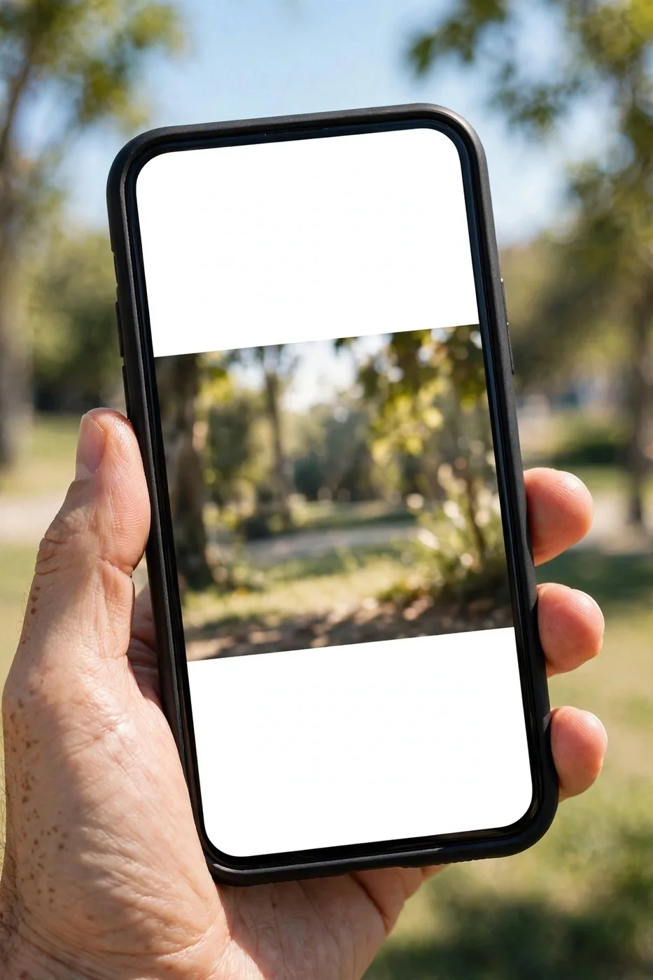
Attempt two: black bars top and bottom, tiny video floating in the middle of a phone screen like evidence in a courtroom presentation. Also bad.
It took me an embarrassing number of tries to learn the truth: converting widescreen to vertical isn't a button you press, it's a decision you make shot by shot. Here's everything I learned, including the three methods I actually use and the export settings that keep vertical clips crisp.
Why the lazy ways look lazy
Let's talk about the two shortcuts everyone tries first, so we can bury them properly.
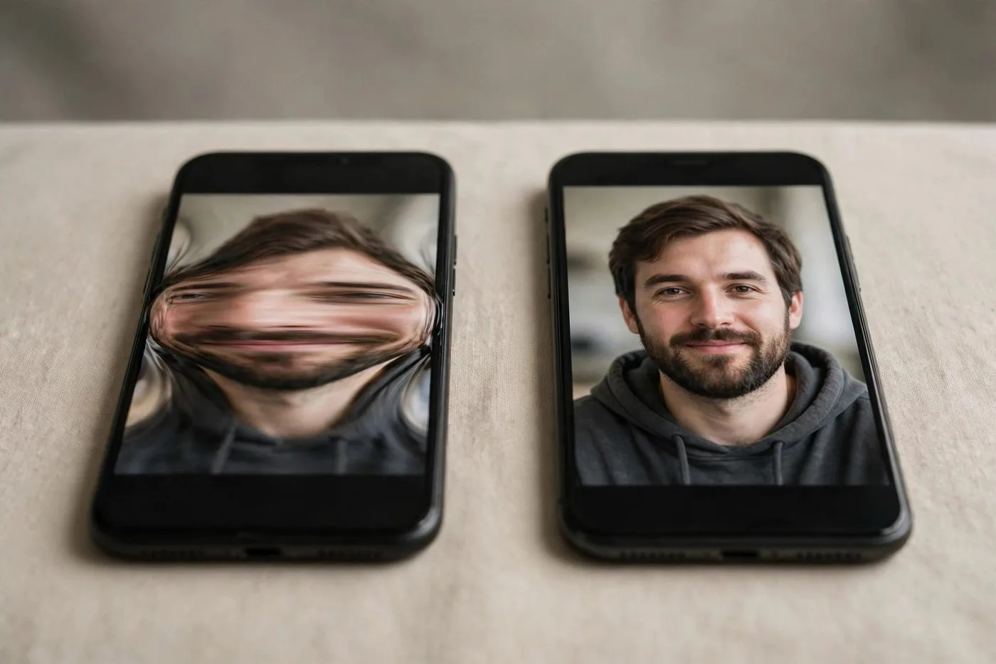
Stretching the 16:9 frame to fill 9:16 distorts everything. Faces get tall, circles become ovals, and viewers notice within half a second. It reads as either lazy or broken, and neither one makes someone keep watching.
Letterboxing, the black bars top and bottom, is less offensive but just as deadly. On a phone, your video now occupies maybe forty percent of the screen. Everything is tiny. Captions are unreadable. The viewer is holding a cinema-sized display and you're showing them a postage stamp.
Both approaches fail for the same reason: they treat the vertical frame as a container to stuff the horizontal video into, instead of treating it as a new composition. When you convert 16:9 to 9:16 properly, you're recomposing the shot, not re-housing it. That mindset shift is the whole game.
Method 1: Reframe on the subject (the right way)
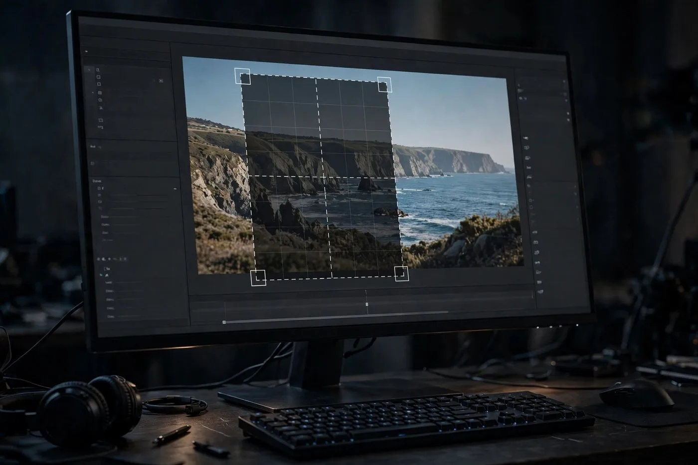
This is the correct method ninety percent of the time. You crop a 9:16 window out of your 16:9 frame and center it on whatever matters: the face, the product, the action.
Here's how to think about it. A 16:9 frame at 1920x1080 gives you a vertical crop of 608x1080 if you take the full height. That's your window. Slide it left or right to follow the subject. If the subject moves, animate the window with keyframes so the crop follows them smoothly.
The key skill is choosing what to sacrifice. In a talking-head shot, you lose the background. Fine. Nobody needed to see your bookshelf anyway. In a two-person shot, you pick the speaker and cut to the other person when they talk. That's not a limitation, that's editing.
Where people mess this up: they center the crop and leave it there while the action happens at the edges. Watch your video once through with the crop applied and nudge the window wherever the subject drifts. Five minutes of keyframing saves the whole clip.
Quality note: you're throwing away roughly two-thirds of your pixels. On a 1080p source, the vertical crop is effectively 608 pixels wide, upscaled to 1080. It looks acceptable on phones, honestly, but if you want it crisp, shoot in 4K when you know vertical is the destination. More on that in the export section.
Method 2: Blurred background fill (the rescue option)
Sometimes you can't crop. The shot has two people on opposite sides, or text across the full width, or action that needs the whole frame. For those cases: blurred background fill.
The technique: duplicate your video layer. The bottom layer gets scaled up to fill the 9:16 frame and heavily blurred. The top layer keeps the full 16:9 frame, centered, at its original proportions. The result looks intentional, like a designed frame, instead of an accident.
This is miles better than black bars. The blur fills the dead space with motion and color that matches the video, so the whole phone screen feels alive. News channels and sports clips use this constantly, which tells you it reads as professional, not cheap.
Two settings matter. Blur amount: enough that the background is abstract, not enough that it's distracting. I usually land around 40 to 60 percent blur with slightly reduced brightness on the background layer. And keep the main video large. The temptation is to shrink it to show more background. Don't. The content is the star.
Use this method sparingly, though. It's a rescue option, not a default. A whole video of blurred-background shots feels static next to properly reframed ones.

Method 3: Let AI track the subject
If manual keyframing sounds tedious, because it is, AI auto-reframe is the third option, and it's gotten genuinely good.
The idea: the tool detects the important subject, faces, moving objects, text regions, and automatically moves the 9:16 crop window to follow it through the shot. You upload horizontal, you get vertical, and the framing decisions happen without you touching a keyframe.
In my experience it nails about eighty percent of shots: talking heads, single subjects, clear action. It struggles with the ambiguous cases: two people arguing across a wide shot, fast action cutting across the frame, scenes where the "subject" is a mood rather than a person. For those, you still want human judgment.
My workflow is hybrid and I'd recommend it: run the AI pass first, then watch the result once and fix the five or ten percent of shots where the crop chose wrong. You get ninety-five percent of the quality of full manual reframing in about ten percent of the time.
One honest caveat: AI reframing works best on high-quality source footage. Feed it a mushy compressed video and the subject detection gets confused. Garbage in, wobbly crop out.
Captions and safe zones: the part everyone forgets
You reframed beautifully. Now don't ruin it with captions the app covers up.
Every short-video platform pastes its own interface over your video: the like and comment buttons on the right edge, the caption and progress bar along the bottom, your profile info. Anything you put in those zones is invisible.
The safe zone rule I use: keep all text inside the middle sixty percent of the frame, both horizontally and vertically. Captions sit in the lower-middle, never the bottom edge. Important visuals stay clear of the right edge.
Test it the honest way: export the clip, upload it as a private or draft post, and watch it in the actual app before publishing. The preview in your editor lies. The app tells the truth.
Font size matters more in vertical than horizontal, because everything is smaller relative to the screen. If you think your captions are big enough, make them ten percent bigger. Future you, squinting at a phone on a bus, says thanks.
Export settings that keep it crisp
Reframing is only half the battle. Bad export settings will mush all your careful work into soup.
Resolution: 1080x1920. That's the standard, and there's no reason to go lower. Some people export at 720x1280 to save file size. Don't. Storage is cheap, first impressions aren't.
Codec: H.264, which is what every platform expects. Bitrate is where quality lives or dies: I export vertical clips at 12 to 20 Mbps for the master file. Yes, the platform will compress it again. Give it a clean, high-bitrate source and the double compression stays invisible. Give it a starved 3 Mbps file and it falls apart.
Frame rate: match your source. Don't convert 30fps to 60fps hoping for smoothness; it just duplicates frames and bloats the file. If you shot 60fps for slow motion, keep it 60.
Color: export in the same color space you edited in, usually Rec. 709. Vertical video doesn't change color science, but phones display it differently than monitors, so do one phone check before you batch-export twenty clips.
File size sanity: a sixty-second 1080x1920 clip at these settings lands around 100 to 150 MB before platform compression. That's fine. Don't pre-compress to please anyone. Once you convert 16:9 to 9:16 regularly, these numbers become muscle memory.
Mistakes I made (so you don't have to)
Squishing. We covered this. My alien-face phase lasted two videos too long.
Black bars on everything. I told myself it looked 'cinematic.' It looked like I didn't know what a phone was.
Centering the crop and walking away. The subject drifted out of frame in half my early clips because I never watched the crop in motion.
Captions under the like buttons. Three videos where the punchline was hidden behind the heart icon. The heart icon got more engagement than the joke.
Exporting at 720p to 'save time.' The time saved was minutes. The quality lost was visible in every single clip.
Forgetting that horizontal and vertical are different compositions. I kept trying to preserve my original framing instead of recomposing. Let the horizontal version go. The vertical one is its own thing now.
Which method when? (a ten-second decision guide)
Here's my cheat sheet for every convert 16:9 to 9:16 job:
- Single subject, talking or presenting: Method 1, manual reframe. Fast, full control, best quality.
- Wide shot you can't crop without losing the point: Method 2, blurred background. Rescue it and move on.
- Long video, many shots, deadline yesterday: Method 3, AI auto-reframe, then fix the mistakes. Speed with a safety net.
- Text-heavy content like tutorials: Method 1, but reframe tighter on the text region, and bump font sizes. Readability beats composition here.
- A mix of everything: AI pass first for speed, manual fixes for the important shots. This is what I do for ninety percent of my own conversions.
And the one rule above all the methods: watch the final vertical version on a real phone before you publish. Every method can fail in ways you won't catch on a monitor. The phone is the truth.
Try Klipya Free
Drop in a horizontal video and get clean vertical clips. No black bars, no squished faces.
Convert to 9:16 Free →